Table of contents
- LambdaTest — A Cross Browser Testing Tool
- 1. Cross Browser Compatibility Issue With Form Input Type — Date/time
- Syntax
- Browser Support
- Fixing Cross Browser Compatibility Issue — jQuery UI
- 2. Cross Browser Compatibility Issue With Form Input Type — Color
- Syntax
- Browser Support
- Fixing Cross Browser Compatibility Issue — Spectrum jquery plugin
- 3. Cross Browser Compatibility Issue With Form Input Type — Range
- Syntax
- Browser Support
- Fixing Cross Browser Compatibility Issue — rangeslider.js polyfill
- 4. Cross Browser Compatibility Issues With Form Input Type — Number
- Syntax
- Browser Support
- Fixing Cross Browser Compatibility Issue — Number Polyfill
- Conclusion
Forms have been an integral part of the HTML ever since its foundation, allowing websites to seamlessly interact with users to collect data. HTML 4 originally had only 8 input types which imposed a huge restriction on developers and capabilities of web forms. However, with the roll out of HTML5 in 2014 and web forms 2.0, 13 new form input types were introduced that supercharged HTML Forms.
The new input types not only introduced specific data fields like telephone, email, url, date, number etc but also added visual interactive widgets like datepickers, colorpickers, sliders etc to enhance user experience to a completely new tangent.
As good as these newly introduced form input types were looking, they posed a plethora of cross browser compatibility, and consistency issues which in some cases could dampen user experience or lead to faulty form submissions.
Today, we are going to look at some to major cross browser compatibility issues with form input types and how to resolve them using javascript/jquery plugins and polyfills so that they work perfectly even in legacy browsers like IE
Automated Functional Testing tests helps to ensure that your web app works as it was intented to. Learn more about functional tests, and how automating them can give you a faster release cycle.
LambdaTest — A Cross Browser Testing Tool
Before we look into ways to fix cross browser compatibility issues, we need a mechanism to check whether our code is being rendered by different browsers in the intended manner or not. However, the idea of maintaining an entire library of browsers on your system and mobile devices is unfeasible and expensive. This is where cloud based cross browser testing tools come to rescue. Well, if you are aiming to perform cross browser testing then LambdaTest is the right platform for you.
With LambdaTest, you can test over 3000+ browsers, and OS combinations hosted by Virtual Machines running through their cloud servers. I will be demonstrating real time testing feature of LambdaTest below, using which we can interact with our web page inside the VM hosted by LambdaTest and ensure whether the fix is working as intended or not.
1. Cross Browser Compatibility Issue With Form Input Type — Date/time
HTML5 introduced 5 new input types that enables web developers to easily add date and time pickers to any website using native HTML without relying on any JavaScript or jQuery library.
date
month
week
time
datetime-local
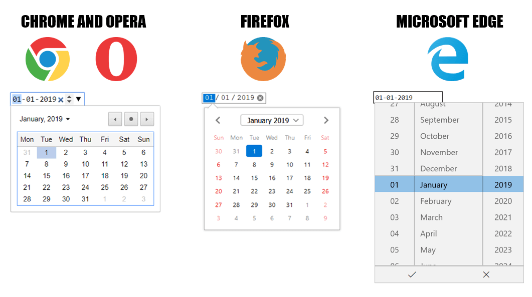
These 5 form input types are used to create input fields that enables a user to select not only a single date, but also a week, month, time, or completely different time zones using a dedicated date/time picker widget interface which varies with different browsers.
NOTE: The HTML < input type= “datetime” > has been deprecated and is no longer supported by browsers. This input time allowed users to pick date, time and time zone. However, it has been replaced by a new input time “datetime-local”.
Syntax
<input type="date" name="user_date" >
<input type="week" name="user_week">
<input type="month" name="user_month">
<input type="time" name="user_time">
<input type="datetime-local" name="user_dateTime">
These input types can be further enhanced by using attributes like min, max, value and step.
<input type=”date” id=”start” name=”startDate “ value=”2019–01–01" min=”1900–01–01" max=”2099–01–01">
max : highest value of acceptable date
min : lowest value of acceptable date
readonly : If the input’s contents are read-only
step : stepping interval when clicking up and down spinner buttons
Form input type — ‘Date’ rendered by different browsers
Through this usability testing tutorial, you will learn how usability testing is a great way to discover unexpected bugs, find what is unnecessary or unused before going any further, and have unbiased opinions from an outsider.
Browser Support
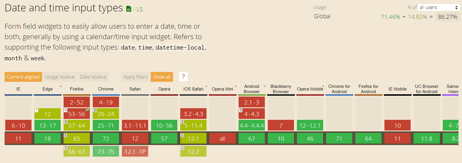
Out of all the new HTML5 form features, date time input types have one of the poorest browser support. As you can see in the above Can I Use screenshot, the 5 Date and Time input types are not supported by any Internet Explorer version, neither by Safari nor by Opera mini. Also, until v57, Firefox also did not support date/time input. In unsupported browsers, < input type”date” >(or time,week,month, or datetime-local) degrades gracefully to a simple text box < input type=”text” >.
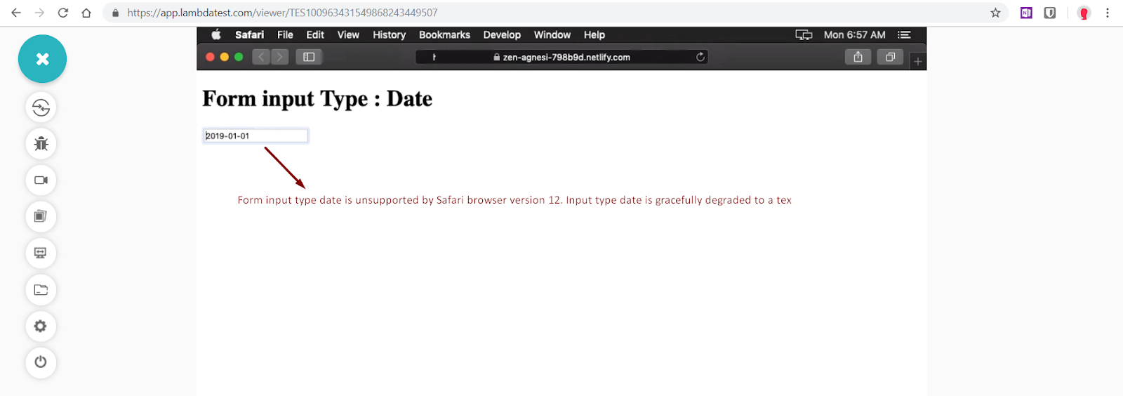
Form Input Type — “Date” is not supported in Safari 12
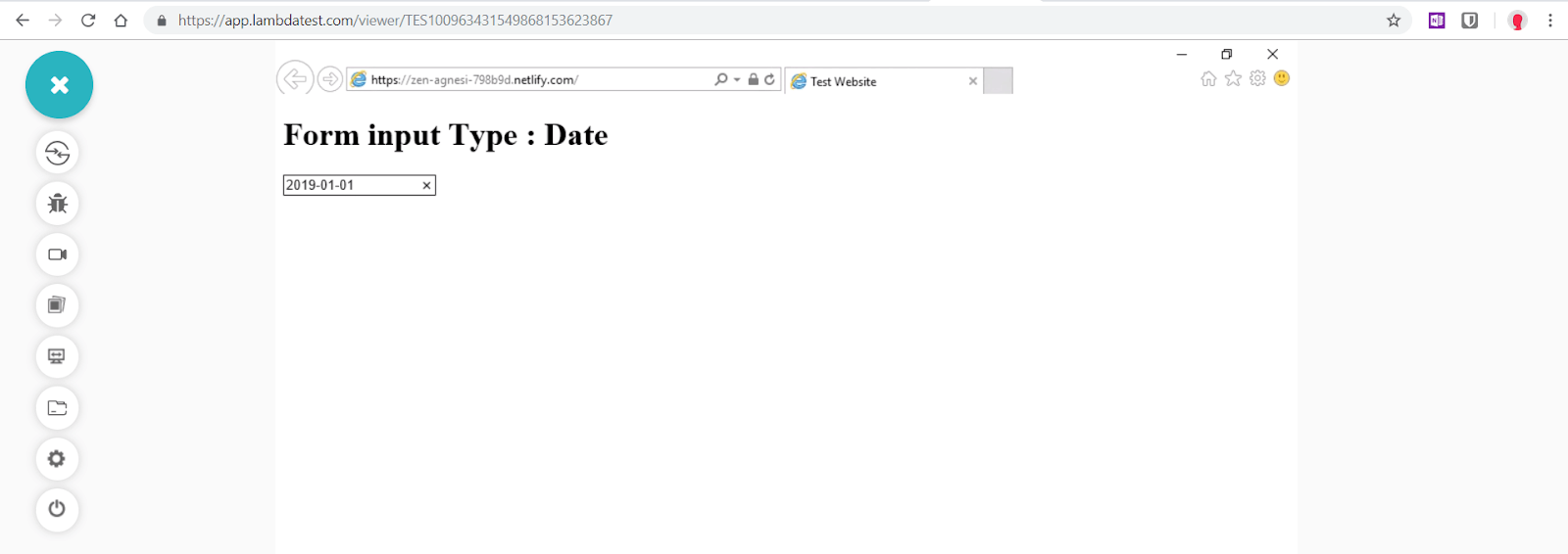
Form Input Type -“Date” is not supported in Internet Explorer 11
Did you notice the cross browser compatibility issue with form input type between Safari 12 & IE 11?
That was just a single instance. What happens if you want to test a static website or if you wish to capture screenshots of the display of your webpage in bulk?
Well, we can make use of Screenshot Testing feature provided by LambdaTest. The automated bulk screenshot capture would allow you to test your website across 25 browser + OS configuration in one go.
You would also find the below tutorial video to be of great use. This video will demonstrate cross browser compatibility issues with form input types related to HTML date property.
Fixing Cross Browser Compatibility Issue — jQuery UI
One of the most popular and reliable way to deal with cross browser compatibility issue with Datepickers is to use a very popular jQuery library called jQuery UI. With the code below, we can leverage jQueryUI’s DatePicker to target all form elements with input type “date” to add date/time picker functionality to not only unsupported browsers like Internet Explorer and Safari but also ensure uniformity in widget interface across all browsers.
Now perform live interactive jQuery mobile testing of your jQuery Mobile websites on LambdaTest.
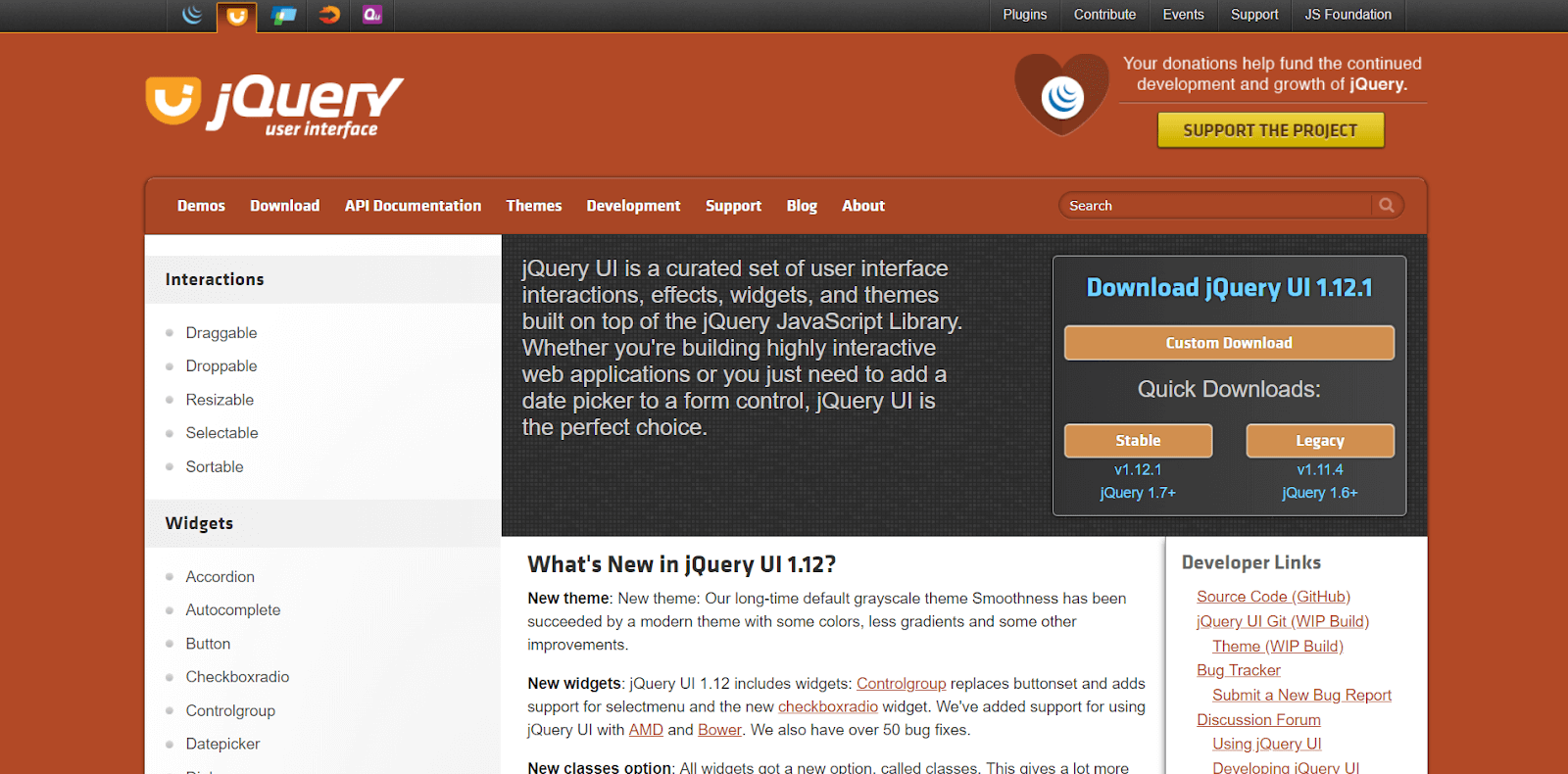
jQuery UI library
Black Box testing? Don’t worry; we will be covering what is Black box testing, merits, demerits, types & techniques.
Head over to jQuery UI website to download necessary files. Add jquery-ui.min.css, jquery-ui.min.js and jquery files to your project. You can also additionally use a theme like ui-lightness.
<head>
    <title>Form Input type Date | jQuery UI</title>
        <link rel="stylesheet" href="/jquery-ui.min.css">
    <link rel="stylesheet" href="https://code.jquery.com/ui/1.12.1/themes/ui-lightness/jquery-ui.css">
    <script src="https://ajax.googleapis.com/ajax/libs/jquery/3.3.1/jquery.min.js"></script>
    <script src="jquery-ui.min.js"></script>
    <script>
        $(function(){
         // Find any date inputs and override their functionality
         $('input[type="date"]').datepicker({ dateFormat: 'yy-mm-dd'});
    });
</script>
</head>

<body>
    <h1>Form input Type : Date</h1>
    <input type="date" id="user-date" name="user-date" value="2018-07-22" min="2019-01-01" max="2019-12-31">
</body>
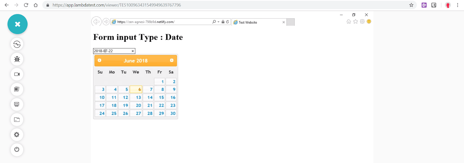
Cross Browser Compatibility Issues With Form Input Type — ‘Date’ is fixed for Internet explorer 11 by using jQuery UI
One drawback of this code is that both native date picker of browser(like chrome or firefox) and jQuery UI will be in effect and overlap. We need to ensure that, if a browser supports input type date, then do not trigger jQuery UI datepicker.
We can ensure this in 2 ways –
- Using vanilla javascript to trigger jQuery UI datepicker only in unsupported browsers. As we discussed earlier, in this case < input type=”date” > is gracefully degraded to < input type=”text” >. As shown in the code below, datepicker is conditionally applied if variable “elem” returns input type — text.
<script>
(function() {
var elem = document.createElement('input');
elem.setAttribute('type', 'date');

if ( elem.type === 'text' ) {
$('input[type="date"]').datepicker({ dateFormat: 'yy-mm-dd'});
}
})();
</script>
2. Using Modernizr javascript library to run feature detection test for form input type date and conditionally loading jQuery Ui datepicker for unsupported browser. If you are new to modernizr then you can follow my other blog where I have demonstrated feature detection with Modernizr for cross browser compatibility. Download modernizr.js development build from the official website.
<script>
$(function(){
if(!Modernizr.inputtypes.date) { /* Browsers that fail in modernizr detection test for date input type  */
$('input[type="date"]').datepicker({ dateFormat: 'yy-mm-dd'});
}
});
</script>
A comprehensive User Acceptance Testing (UAT) tutorial that covers what User Acceptance Testing is, its importance, benefits, and how to perform it with real-time examples.
2. Cross Browser Compatibility Issue With Form Input Type — Color
Form input type color enables users to either enter a hex value of a color in the text field or select a color from a visual color picker widget which is implemented natively by browsers. Some browsers allow only simple hexadecimal values are allowed without any alpha value. The color picker widget varies from browser to browser.
Syntax
< input type=”color” name=”user-color” value=”#ff0000" >
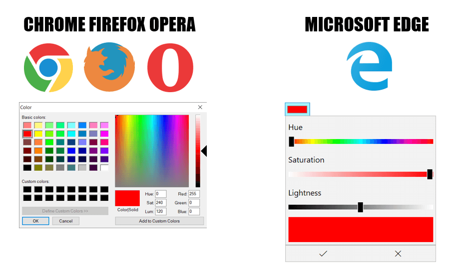
Form Input Type — ‘Color’ rendered by different browsers
Browser Support

Just like date and time input types, color type is also plagued with poor browser support. While all major browsers like Google Chrome, Opera, Mozilla Firefox and Edge do support form input type color; Internet Explorer, Safari, iOS and Opera mini don’t support this feature. Color picker functionality for these browsers can be added by using javascript/jQuery plugins or polyfills.
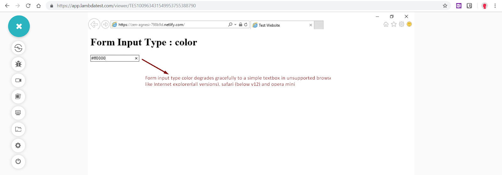
Form Input Type — “Color” is not supported in Internet Explorer 11
Fixing Cross Browser Compatibility Issue — Spectrum jquery plugin
Since jQuery UI does not offer a colorpicker plugin, we can instead utilise Spectrum, a jQuery plugin which is not only highly customizable, but can also be used as a simple input type=color polyfill.
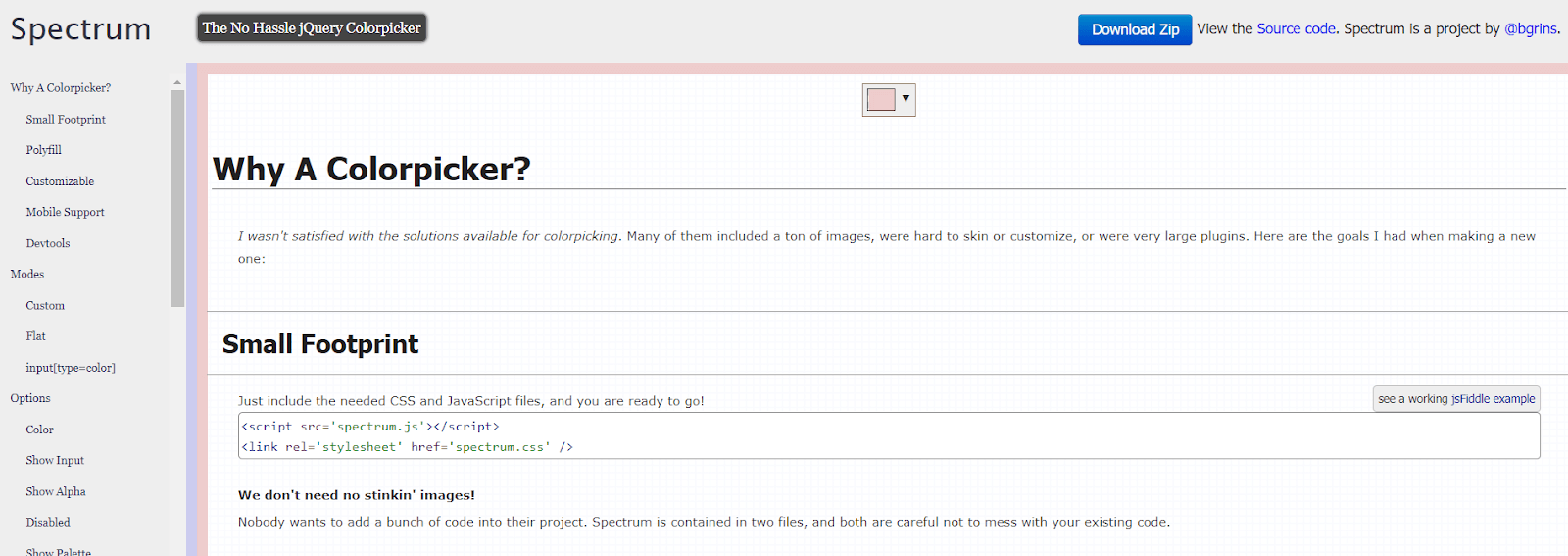
Spectrum colorpicker jQuery plugin
Visit Spectrum Github repository and download spectrum.css and spectrum.js files. Spectrum color picker can be further customised as shown in the code below.
<head>
    <title> Form Input type Date | jQuery UI </title>
    <link rel="stylesheet" href="/spectrum.css">
    <script src="https://ajax.googleapis.com/ajax/libs/jquery/3.3.1/jquery.min.js"></script>
    <script src="/spectrum.js"></script>
</head>

<body>
    <h2>Basic Usage</h2>
    <input type='text' id="basic" />

    <script>
        $("#basic").spectrum({
            color: "#f00",
            change: function (color) {
                $("#basic-log").text("change called: " + color.toHexString());
            }
        });
    </script>

</body>
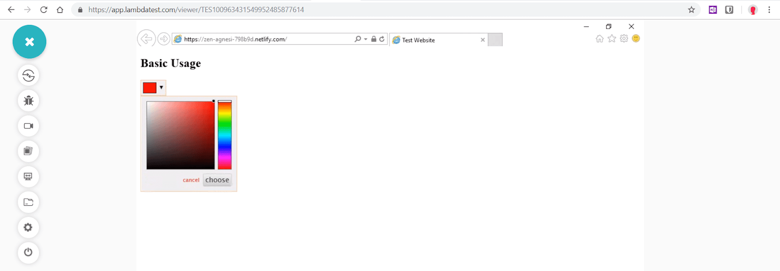
Cross Browser Compatibility Issues With Form Input Type — “Color” is fixed for Internet explorer 11 by using Spectrum plugin
A comprehensive UI testing tutorial that covers what UI testing is, its importance, benefits, and how to perform it with real-time examples.
Full Customisation
<body>
<h2>Basic Usage</h2>
    <input type='text' id="basic" />
    <em id='basic-log'></em>

    <h2>Full Example</h2>
    <input type='text' id="full" />

    <script>
        $("#basic").spectrum({
            color: "#f00",
            change: function (color) {
                $("#basic-log").text("change called: " + color.toHexString());
            }
        });

        $("#full").spectrum({
            color: "#ECC",
            showInput: true,
            className: "full-spectrum",
            showInitial: true,
            showPalette: true,
            showSelectionPalette: true,
            maxSelectionSize: 10,
            preferredFormat: "hex",
            localStorageKey: "spectrum.demo",
            move: function (color) {

            },
            show: function () {

            },
            beforeShow: function () {

            },
            hide: function () {

            },
            change: function () {

            },
            palette: [
                ["rgb(0, 0, 0)", "rgb(67, 67, 67)", "rgb(102, 102, 102)",
                    "rgb(204, 204, 204)", "rgb(217, 217, 217)", "rgb(255, 255, 255)"
                ],
                ["rgb(152, 0, 0)", "rgb(255, 0, 0)", "rgb(255, 153, 0)", "rgb(255, 255, 0)",
                    "rgb(0, 255, 0)",
                    "rgb(0, 255, 255)", "rgb(74, 134, 232)", "rgb(0, 0, 255)", "rgb(153, 0, 255)",
                    "rgb(255, 0, 255)"
                ],
                ["rgb(230, 184, 175)", "rgb(244, 204, 204)", "rgb(252, 229, 205)", "rgb(255, 242, 204)",
                    "rgb(217, 234, 211)",
                    "rgb(208, 224, 227)", "rgb(201, 218, 248)", "rgb(207, 226, 243)", "rgb(217, 210, 233)",
                    "rgb(234, 209, 220)",
                    "rgb(221, 126, 107)", "rgb(234, 153, 153)", "rgb(249, 203, 156)", "rgb(255, 229, 153)",
                    "rgb(182, 215, 168)",
                    "rgb(162, 196, 201)", "rgb(164, 194, 244)", "rgb(159, 197, 232)", "rgb(180, 167, 214)",
                    "rgb(213, 166, 189)",
                    "rgb(204, 65, 37)", "rgb(224, 102, 102)", "rgb(246, 178, 107)", "rgb(255, 217, 102)",
                    "rgb(147, 196, 125)",
                    "rgb(118, 165, 175)", "rgb(109, 158, 235)", "rgb(111, 168, 220)", "rgb(142, 124, 195)",
                    "rgb(194, 123, 160)",
                    "rgb(166, 28, 0)", "rgb(204, 0, 0)", "rgb(230, 145, 56)", "rgb(241, 194, 50)",
                    "rgb(106, 168, 79)",
                    "rgb(69, 129, 142)", "rgb(60, 120, 216)", "rgb(61, 133, 198)", "rgb(103, 78, 167)",
                    "rgb(166, 77, 121)",
                    "rgb(91, 15, 0)", "rgb(102, 0, 0)", "rgb(120, 63, 4)", "rgb(127, 96, 0)",
                    "rgb(39, 78, 19)",
                    "rgb(12, 52, 61)", "rgb(28, 69, 135)", "rgb(7, 55, 99)", "rgb(32, 18, 77)",
                    "rgb(76, 17, 48)"
                ]
            ]
        });
    </script>

</body>
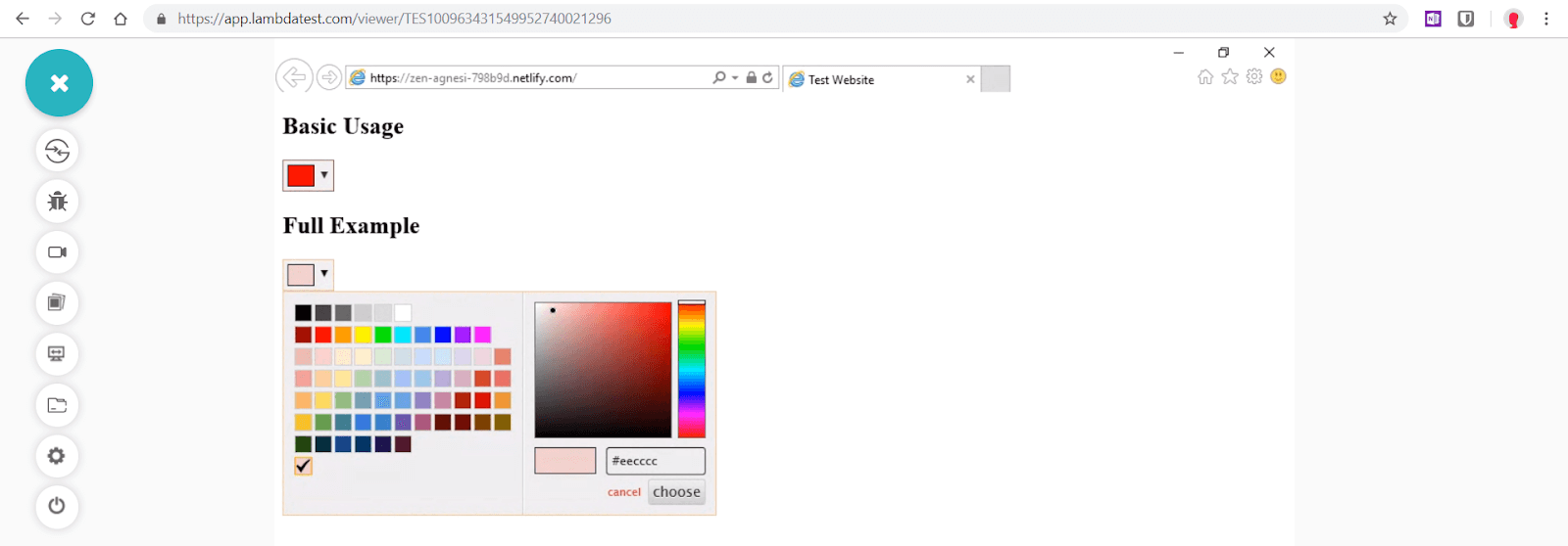
Spectrum colorpicker plugin Full Customisation
3. Cross Browser Compatibility Issue With Form Input Type — Range
Form input type range enables users to select a numeric value inside a predefined range — no less than specified minimum value and not greater than specified max value (default range is 0 to 100). Majority of browsers render form input type range as a slider while some can also render it as a dial control. Range input type should only be used when exact value isn’t required to be too precise
Syntax
< input type=”range” name=”points” min=”0" max=”10" >
Range input type can be further enhanced by using attributes like min, max, value and step.
< input type=”range” name=”points” min=”0" max=”100" value=”50" step=”10" >
max : The highest value in the range slider
min : lowest value in the range slider
step : stepping interval by which slider moves

Form Input Type — ‘Range’ rendered by different browsers
Browser Support

Unlike date and color form input types, range enjoys a much wider cross browser compatibility. Internet explorer 10–11 as well as all versions of Safari browser for Mac and iOS support range input type. Only noticeable exception is Internet Explorer 9.
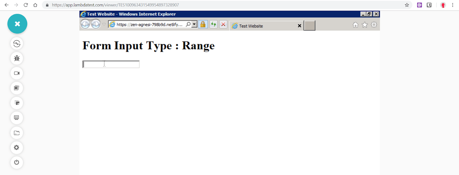
Form Input Type — “Range” is not supported in Internet Explorer 9
Fixing Cross Browser Compatibility Issue — rangeslider.js polyfill
To add form input type range functionality to IE9, the most pragmatic and easy to implement solution is offered by rangeslider.js, which is a lightweight javascript/jquery polyfill that provides a fully customizable range slider.
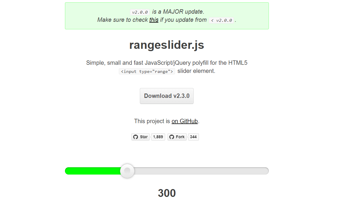
rangeslider.js polyfil
Visit rangeslider.js Github repository and download rangeslider.min.css and rangeslider.min.js files or simply use CDN links as shown below –
<head>
     <title>Form Input Type Range | Rangeslier.js</title>
    <link rel="stylesheet" href="https://cdnjs.cloudflare.com/ajax/libs/rangeslider.js/1.2.1/rangeslider.min.css">
</head>

<body>
    <h1>Form Input Type : Range</h1>
    <input id="range-control" type="range" min="0" max="100" step="1" value="0">
    <script src="https://ajax.googleapis.com/ajax/libs/jquery/3.3.1/jquery.min.js"></script>
    <script src="https://cdnjs.cloudflare.com/ajax/libs/rangeslider.js/1.2.1/rangeslider.min.js"></script>
    <script>
        $("#range-control").rangeslider({
            polyfill: false,
            onSlideEnd: function (position, value) {
                console.log('Position', position, 'Value', value);
            }
        });
    </script>
</body>
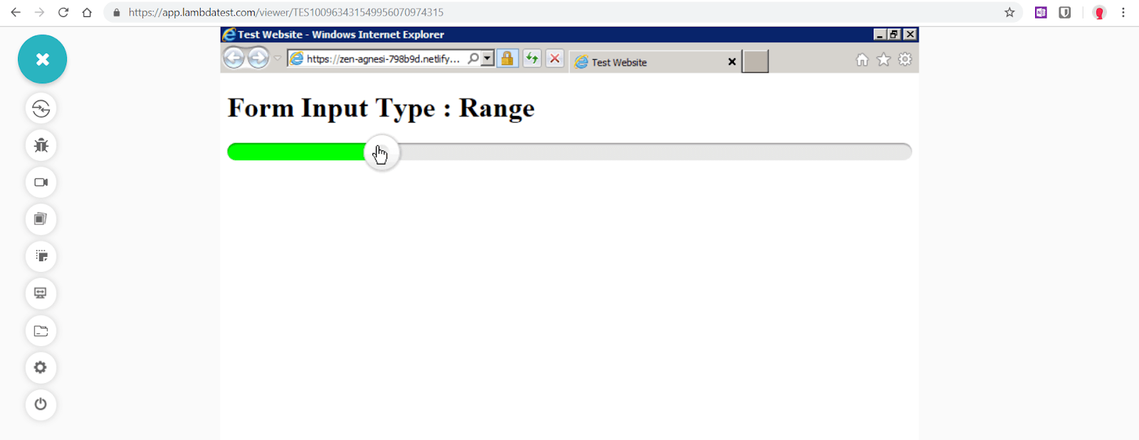
Cross Browser Compatibility Issues With Form Input Type — “Range” is fixed for Internet Explorer 9 by using range slider.js
4. Cross Browser Compatibility Issues With Form Input Type — Number
Form input type number permits users to enter only a numeric value in the text field or use spinbox button controls(up and down arrows). Opera was the first browser to implement number input type. While majority of browsers provide spinbox controls IE10+ and Edge don’t. However, if the field is fed with a non-numerical value, it won’t be retained when field focus is lost.
Syntax
<input type=”number” name=”quantity” min=”1" max=”10">
Number input type can be further enhanced by using attributes like min, max, placeholder, step and readonly.
<
pre><input type=”number” name=”points” min=”0″ max=”10″ placeholder=”5 step=”1″>
max : the highest numeric value acceptable
min : the lowest numeric value acceptable
Placeholder : display the default numeric value in the field
step : step control(up/down arrows) which increments or decrements the numeric value

Form input type — ‘Numer’ rendered by different browsers
Browser Support

Just like input type range, number along with other input types such as email, tel, url are cross browser compatible features supported by IE 10–11 as well as safari. IE9 is the only major exception.
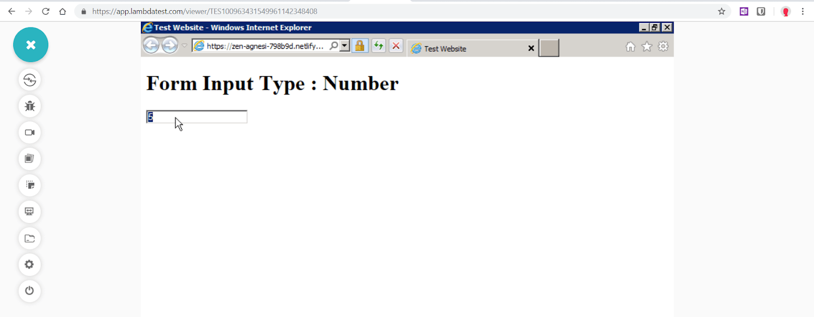
Form Input Type — “Number” is not supported in Internet Explorer 9
In this tutorial on Agile testing, let’s deep dive into the history of Agile testing, its advantages, disadvantages, methods, quadrants, and best practices.
Fixing Cross Browser Compatibility Issue — Number Polyfill
To add form input type number functionality to IE9, we can utilise number polyfill by jonstipe as also suggested by html5please. Only requirement is to add number-polyfill.js file in the head section. CSS file can be used to style the the field along with increment decrement arrows. If the script detects that a browser doesn’t support number input type, it will configure it to function as number-only input field, and add increment/decrement arrow buttons.
<head>
    <title> Form Input Type Number | Number Polyfill </title>
    <link rel="stylesheet" href="/inputnumber.css">
</head></p>

<body>
    <h1>Form Input Type : Number</h1>
    <input type="number" class="modify-me" />
    <script src="https://ajax.googleapis.com/ajax/libs/jquery/3.3.1/jquery.min.js"></script>
    <script src="jquery.inputnumber.min.js"></script>
    <script>
        $().ready(function () {
            $('.modify-me').inputNumber();
        });
    </script>
</body>
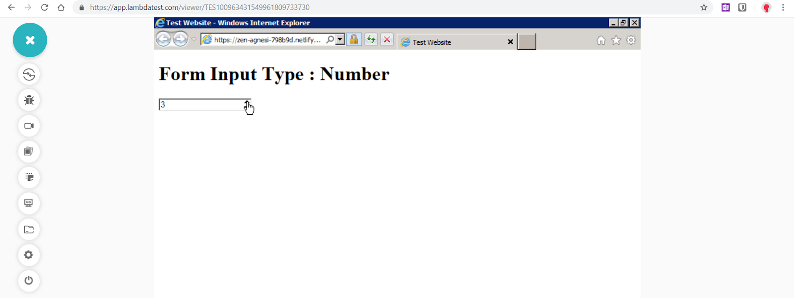
Cross Browser Compatibility Issues With Form Input Type — “Number” is fixed for Internet Explorer 9 by using Number Polyfill
LambdaTest’s LT Browser is a next-gen browser to build, test & debug mobile websites. Try it now, for free!
Conclusion
It has almost been a decade since the notion of HTML5 form features also known as Web forms 2.0 was contemplated. Majority of the new form input types are cross browser compatible, supported by all the major modern browsers, the only noticeable exceptions being Safari and Opera Mini. In near future, it is highly likely that we will witness cross browser uniformity in visual interfaces of form elements and input types and also a strong possibility that all remaining inconsistencies, especially Safari and Opera browsers will be resolved for good. The only thorn in the way of developers is IE11/IE9 that is notorious for its beleaguered support. But armed with the right javascript/jquery plugins, libraries and polyfills, web developers now have a reliable way to keep cross browser compatibility issues with form input types at bay.
