Table of contents
- What Are CSS Gradients?
- 1. CSS Linear Gradient
- Top To bottom Linear CSS Gradients
- Left To Right Linear CSS Gradients
- Diagonal Linear CSS Gradients
- Angled Linear CSS Gradients
- Multiple Color
- Color Stops
- Color Stop Solid transition
- Cross Browser Compatibility Solution For CSS Linear Gradient
- Angled CSS Linear Gradients
- 2. CSS Radial Gradient
- Basic Example Of Radial CSS Gradients With Evenly Spaced Color-stops
- Radial CSS Gradients With Differently Spaced Color Stops
- Radial CSS Gradients With Circle Shape:
- Radial CSS Gradients With Different Size Values
- Radial CSS Gradients With Different Position Values
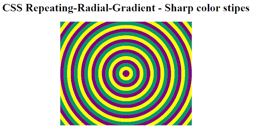
- Radial CSS Gradients With Sharp Color Stops
- Cross Browser Compatibility Solution For Radial CSS Gradients
- 3. CSS Conical Gradients
- Basic Conical CSS Gradients Pattern
- 2. Creating A Pie Chart With CSS Conical Gradients
- Creating A Donut Chart With CSS Conical Gradients
- Cross Browser Compatibility Solution For CSS Conical Gradients
- 4. CSS Repeating Gradients
- repeating-linear-gradient() :
- repeating-radial-gradient() :
- repeating-conic-gradient() :
- What You Learnt!
CSS gradients for background have become an indispensable aspect UI/UX design and have a massive impact on a website’s design. It plays a fundamental role in setting the design hierarchy, capturing user attention and focus, and finally defining website usability and appearance. The common forms of backgrounds that websites employ could either be solid colors, images, gradients or a combination of all three.
CSS Gradients for background empowers designers for displaying smooth transitions between numerous colors. Not only are gradients being used for header or section backgrounds but also for creating CSS Gradients for overlays, text, buttons, borders, outlines, skewed blocks and banners. Before the advent of CSS Gradients for background, developers had no other choice but to resort to images to create such effects.
However, this method had huge drawbacks that would hurt websites performance. Using large number of images especially for trivial purpose would lead to a massive spike in website loading speed and bandwidth usage. But by harnessing the power of CSS Gradients designers can ensure faster site loading time without sacrificing resolution and clarity just by using simple native functions for CSS Gradients.
In this XCUITest tutorial, learn about XCUITest framework and its benefits for mobile automation testing. Take a look at how XCUITest works and see how to use it to test your mobile applications.
What Are CSS Gradients?
The CSS gradients are realised by the use of gradient functions which create a progressive transition between multiple colors. One important requisite for using CSS gradients is that they belong to
data type and can only be applied to background-image property or shorthand “background” instead of CSS properties with data type such as “color” or “background-color”. CSS Gradients in background have no defined intrinsic dimensions and are devoid of any specific dimension size or ratio. It simply adopts to the dimension of the element it is applied to on the fly.
CSS3 defines 4 major types of gradients.
Linear CSS Gradient
Radial CSS Gradient (also elliptical)
Conical CSS Gradient
Repeating CSS Gradient
Except Conical gradient, the other 3 types of CSS gradients i.e. Radial, Repeating, and Linear CSS Gradients enjoys good browser support with the only exception being IE 6–9 and Opera mini browser. Conical gradients is still in an experimental stage and not yet adopted by the majority of browsers including Firefox, Edge and Opera.
Only the latest version of Chrome (69+) and Safari(12.1+) provide support for this feature. We will discuss browser support for these 4 types of CSS gradients in detail, we will also perform cross browser testing for figuring cross browser compatibility solutions of these CSS gradients.
Test your website or web app online for iOS browser compatibility. Perform seamless cross browser testing on the latest iPhone tester Simulator. Try for free.
1. CSS Linear Gradient
CSS Linear Gradients facilitates smooth, escalating transition between numerous colors along a straight line. You can make these transitions to move in — up, down, left, right or diagonal direction. You need to specify a minimum of 2 colors (called color-stops) to create this effect along optionally specifying the direction and start points.
Syntax For Linear CSS Gradientsbackground-image: linear-gradient(direction, colorStop1, colorStop2, …);
Direction : Used to set the direction or angle of the CSS linear gradient effect. Direction can either be — top, bottom, left, right or in deg or in turn. It is optional to specify direction. Note that If direction is not specified, by default it will be set to top to bottom.
Color-Stops : Consists of color value followed by a start point. Start point can be in % or a length value. It is optional to define start points.
Some examples of CSS linear gradient with different set of values.
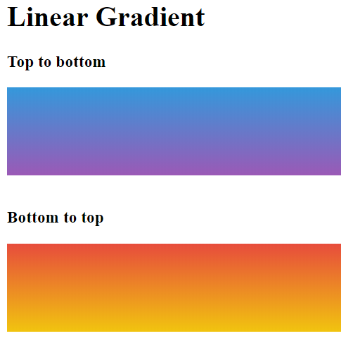
Top To bottom Linear CSS Gradients
The transition in this case starts from top to bottom direction with blue color on top and ends with purple color on bottom. Specify “to bottom” direction or it will be set by default . To create a reverse bottom to top gradient, reverse the direction to “to top”
<style>
        #grad1 {
            width: 25%;
            height: 100px;
            background-image: linear-gradient(to bottom, #3498db, #9b59b6); /*top to bottom Gradient*/
        }
        #grad2 {
            width: 25%;
            height: 100px;
            background-image: linear-gradient(to top, #f1c40f, #e74c3c); /*bottom to top Gradient*/
        }
    </style>
Which are the most wanted test automation tools in 2023 that have climbed the top of the ladder so far? Let’s take a look.
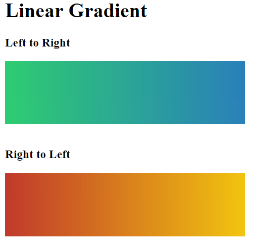
Left To Right Linear CSS Gradients
The transition in this case starts in left to right direction with green color on left and ends with blue color on right. Specify “to right” direction or to create a reverse bottom to top gradient, reverse the direction to “to left”.
<style>
        #grad1 {
            width: 25%;
            height: 100px;
            background-image: linear-gradient(to right, #2ecc71, #2980b9); /*Left to Right Gradient*/
        }
        #grad2 {
            width: 25%;
            height: 100px;
            background-image: linear-gradient(to left, #f1c40f, #c0392b); /*Right to Left Gradient*/
        }
    </style>
Diagonal Linear CSS Gradients
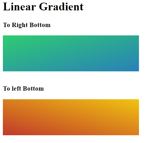
The transition in this case starts from top left to bottom right direction with green color at the top left and ends with blue color at bottom right. Specify “to bottom right” direction for this case or specify “to left bottom” to create a reverse scenario using diagonal CSS linear gradient.
<style>
        #grad1 {
            width: 25%;
            height: 100px;
            background-image: linear-gradient(to right bottom, #2ecc71, #2980b9); /*Top left to Right Bottom*/
        }
        #grad2 {
            width: 25%;
            height: 100px;
            background-image: linear-gradient(to left bottom, #f1c40f, #c0392b); /*Top Right to Left Bottom*/
        }
    </style>
iphone emulator by LambdaTest allows you to seamlessly test your websites and webapp on latest to legacy devices, OS versions and browsers. You can also test your iOS app online on 200+ device and iOS environmets. Sign up for free.
Angled Linear CSS Gradients
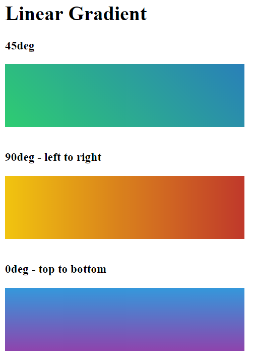
To create an angled CSS linear gradient, define the direction not by using to top, bottom left, right parameters. Instead specify the direction using deg — any value between 0 and 360deg.
45deg will create a diagonal CSS linear gradient.
0deg will create a top to bottom CSS linear gradient.
90deg will create a left to right CSS linear gradient.
<style>
        #grad1 {
            width: 25%;
            height: 100px;
            background-image: linear-gradient(45deg, #2ecc71, #2980b9); /*45deg*/
        }
        #grad2 {
            width: 25%;
            height: 100px;
            background-image: linear-gradient(90deg, #f1c40f, #c0392b); /*90deg*/
        }
        #grad3 {
            width: 25%;
            height: 100px;
            background-image: linear-gradient(0deg, #8e44ad, #3498db); /*0deg*/
        }
    </style>
Test your native app and website on real iOS and Android devices hosted on the cloud. LambdaTest is a convenient, cost-effective and centralised solution for running realtime and Automated test on real device cloud.
Multiple Color
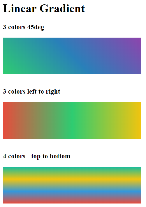
There is no limit to the number of colors that you can specify to create the gradient effect. Below example will help you create CSS gradients with 3 and 4 colors.
<style>
        #grad1 {
            width: 25%;
            height: 100px;
            background-image: linear-gradient(45deg, #2ecc71, #2980b9, #8e44ad); /*45deg*/
        }
        #grad2 {
            width: 25%;
            height: 100px;
            background-image: linear-gradient(to left, #f1c40f, #2ecc71, #e74c3c); /*90deg*/
        }
        #grad3 {
            width: 25%;
            height: 100px;
            background-image: linear-gradient(to bottom, #1abc9c, #f1c40f, #3498db, #e74c3c); /*0deg*/
        }
    </style>
Color Stops
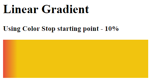
If color stops or starting points are not specified, the entire space of the element on which linear CSS gradients are being applied is divided equally among all the listed colors specified inside the gradient function. However, CSS allows you to change this behaviour and control how much space any color occupies by specifying its starting point either in % or in length units. In the example below we will set the starting point of yellow color (#f1c040f) to 20%. By default it would have been 0% for the first color — #e74c3c and 100% for the second color #f1c40f.
<style>
        #grad1 {
            width: 25%;
            height: 100px;
            background-image: linear-gradient(to right,#e74c3c,#f1c40f 10%);
        }
    </style>
Test your native app and website on real iOS and Android devices hosted on the cloud. LambdaTest is a convenient, cost-effective and centralised solution for running realtime and Automated test on mobile device cloud testing.
Color Stop Solid transition
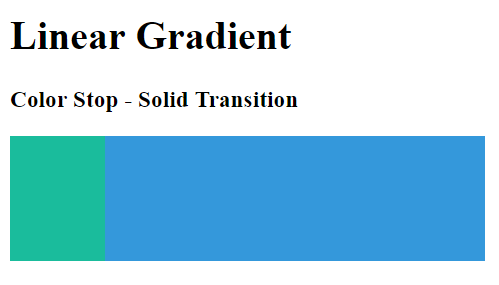
Instead of progressive fading effect, we can also create solid transition between two or more colors specified in the linear CSS gradients function by using starting points trick. Set the start points of both colors to the same value to achieve this effect. Refer to the example below –
<style>
        #grad1 {
            width: 25%;
            height: 100px;
            background-image: linear-gradient(to right,#1abc9c 20%,#3498db 20%);
        }
    </style>
Cross Browser Compatibility Solution For CSS Linear Gradient
All desktop browsers including Internet Explorer 11 and Microsoft Edge provide browser support for Linear CSS Gradients, meaning these CSS Gradients offer excellent cross browser compatibility. The only exception that developers need to watch out for is IE6–9 and Opera Mini for which they need to perform cross browser testing.
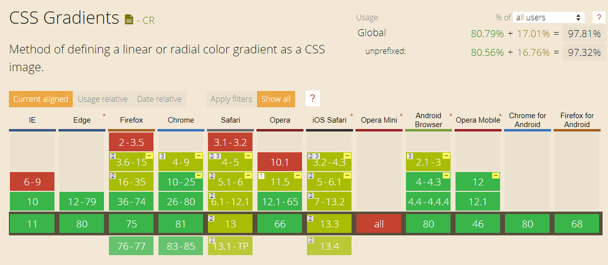
CanIUse Cross browser compatibility tabe for CSS Linear Gradient
As you can see in the CanIUse table above, older versions of Mozilla Firefox, Opera, Safari and Google Chrome provided partial support (browsers version marked with yellow green color). You need to use dedicated vendor prefixes for each of those legacy/older versions to make CSS linear gradients cross browser compatible. Also, we will explore the Microsoft Filer property to add gradient functionality to Microsoft Internet Explorer i.e. IE 6–9 to offer cross browser compatibility.
Test native, hybrid, and web apps on any mobile OS with our free android device emulator. Sign up to optimize app performance.
Syntax For Cross Browser Compatible Linear CSS Gradients
Modern versions of all major browsers support the W3C standards for linear CSS gradients, making it a highly preferable choice due to its cross browser compatibility.
- For Google Chrome 25+, Mozilla Firefox 16+, Opera 15+, Safari 6.1+, IE 10+, iOS 7+, Android 4.4+
background-image: linear-gradient(45deg, red 0%, blue 100%);
In order to add support for older versions of Google Chrome, Mozilla Firefox, Safari, Opera and IE we will use specific vendor prefixes mentioned below and create a cross browser compatibility solution.
- For Google Chrome(v 4–9) and Safari (v 4–5)
background-image: -webkit-gradient(linear, left bottom, right top, color-stop(0%, red), color-stop(100%, blue));
- For Chrome (v 10–25) and Safari(v 5.1–6)
background-image: -webkit-linear-gradient(45deg, red 0%, blue 100%);
- For Firefox(v 3.6–15)
background-image: -moz-linear-gradient(45deg, red 0%, blue 100%);
- For Opera(v 11.5)
background-image: -o-linear-gradient(45deg, red 0%, blue 100%);
- For IE 10+
background-image: -ms-linear-gradient(45deg, red 0%, blue 100%);
- For IE6–9
filter: progid:DXImageTransform.Microsoft.gradient( startColorstr='#ff0000', endColorstr='#0000ff',GradientType=1 );

-ms-filter: "progid:DXImageTransform.Microsoft.gradient (GradientType=0, startColorstr=#ff0000, endColorstr=#0000ff)";
NOTE: IE6–9 only support two color gradients in left to right direction.
- Solid color or JPG/SVG fallback
background-color: red; or background-image: url(fallback.jpg);
Although, it is not prudent to worry about coding prefixes to support legacy browser versions like Chrome 10–25 or Safari 6. However, all modern browsers (except Edge) are backward compatible and understand the prefixed syntax. Moreover, many developers use tools like — Autoprefixer or other extensions in popular Code editors to take care of vendor prefixes. It is important for any developer to understand the prefixed syntax that autoprefixer is adding to their code.
Angled CSS Linear Gradients
There is one more complication that you need to address before moving ahead with writing cross browser compatible code for linear CSS gradients. The complication lies with the “Angled CSS Linear Gradients”. Old prefixed syntax supported by older browser versions and the new unprefixed syntax supported by modern browsers comprehend “Angled CSS Linear Gradients” in a different manner to each other.
Unprefixed new syntax : supported by — Chrome 25+, Firefox 16+, Opera 15+, Safari 6.1+, IE 10+. It defines 0 deg in bottom-to-top direction and proceeds in clockwise direction. 0deg is top to bottom and 90deg is left-to-right
Prefixed old syntax : supported by — Chrome 10–25, Firefox 3.6–15, Opera 11.1–11.5, Safari 5.1–6. It defines 0 deg in left to right direction and proceeds in anti-clockwise direction, ie — 0 deg is left to right and 90deg is bottom to top.
Legacy syntax : supported by — Chrome 1–9, Safari 4–5. Does not support angles. Impractical to be concerned with today.
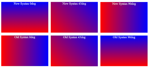
Here is a simple conversion formula you can use to get the same gradient effect in both the syntax-
New angle(unprefixed new syntax) : 90 — Old angle (prefixed old syntax)
Old angle (prefixed old syntax) : 90 — New angle(unprefixed new syntax)
For example –
If new angle is 0 deg then old angle = 90–0 = 90deg
background: -webkit-linear-gradient(90deg, red, yellow, green);
background: linear-gradient(0deg, red, yellow, green);
If new angle is 45deg, then old angle = 90–45 = 45deg
background: -webkit-linear-gradient(45deg, red, yellow, green);
background: linear-gradient(45deg, red, yellow, green);
If new angle is 90 deg then old angle = 90–90 = 0deg
background: -webkit-linear-gradient(0deg, red, yellow, green);
background: linear-gradient(90deg, red, yellow, green);
if new angle is 135deg, then old angle = 90–135 = -45deg
background: -webkit-linear-gradient(-45deg, red, yellow, green);
background: linear-gradient(135deg, red, yellow, green);
Now, after we have solved the complication with Gradient angle, we can compile together all the vendor prefixes and fallbacks to arrive at the final cross browser compatible solution for CSS linear Gradients.
<html>
<head>
   <style>
       #grad1 {
           width: 25%;
           height: 100px;
           /* Solid color or jpg fallback */
           background-color: red; /*background-image: url(fallback.jpg);*/
           /* For Google Chrome(v 4-9) and Safari (v 4-5) */
           background-image: -webkit-gradient(linear, left bottom, right top, color-stop(0%, red), color-stop(100%, blue));
           /* For Chrome (v 10-25) and Safari(v 5.1-6)  */
           background-image: -webkit-linear-gradient(45deg, red 0%, blue 100%);
           /* For Firefox(v 3.6-15)  */
           background-image: -moz-linear-gradient(45deg, red 0%, blue 100%);
           /* For Opera(v 11.5) */
           background-image: -o-linear-gradient(45deg, red 0%, blue 100%);
           /* For IE 10+ */
           background-image: -ms-linear-gradient(45deg, red 0%, blue 100%);
           /* For IE6-9 */
           filter: progid:DXImageTransform.Microsoft.gradient(startColorstr='#ff0000', endColorstr='#0000ff', GradientType=1);
           -ms-filter: "progid:DXImageTransform.Microsoft.gradient (GradientType=0, startColorstr=#ff0000, endColorstr=#0000ff)";
           /* For Modern browsers */
           background-image: linear-gradient(45deg, red 0%, blue 100%);
       }
   </style>
</head>

<body>
   <h1>Linear Gradient</h1>
   <h3>Cross Browser Compatible Solution For All Browsers And Versions</h3>
   <div id="grad1"></div>
</body>
</html>
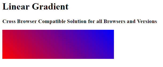
If you are interested to see how our code appears across different browsers and versions that we discussed above, use a cross browser testing tool such as LambdaTest to validate cross browser compatibility testing across 3000+ real browsers and browser versions.
Debug app on android device and get instant feedback. Find bugs early on, improve performance, quality, user experience, and save time with instant support on LambdaTest.
2. CSS Radial Gradient
CSS radial-gradient() function is used to create a smooth progressive transition between 2 or more colors radiating from a singular point of origin called center rather than a straight line in case of CSS linear gradients.
The resulting gradient shape is in the form of a circle or an ellipse. A radial CSS gradient starts from a singular point of origin called center and radiates outwards to form concentric shapes which could be circles or ellipses. The color mentioned first is at the center position and proceeds to fade outwards into other colors towards the edge of element.
A radial CSS gradient can be represented with shape, size, position along with multiple color-stop points. Series of concentric colors bands or shapes are placed along an axis called virtual gradient ray that traverses from center to the ending shape in the rightward direction.
Syntax For Radial CSS Gradientsbackground-image: radial-gradient( , color-stop stop%, ..., color-stop stop%);
Shape : Specifies the shape of the radial CSS gradients. CSS Gradient Shape value can either be an ellipse or a circle. By default the shape is set to ellipse.
Size : Defines the size of the radial CSS gradients with respect to the element shape. Size value can be of 4 types — Farthest Corner, Farthest Side, Closest Corner or Closest Side. By default value is set to farthest corner.
Position : Relays the position of the radial CSS gradients. Values can be top left right bottom or center or combination of 2 values. Value of position can also be in %. By default it is set to “at center center” or “at 50% 50%”.
Color-stops : Defines a color value followed by a stop value in % between 0–100%. Mentioning stop value is optional. 0% implies the center of the shape, it could be either circle or ellipse, while a 100% represents an intersection point of virtual gradient ray along with the ending shape.
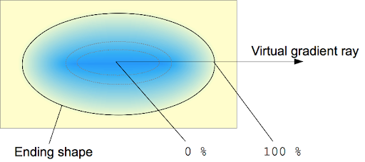
Image Credits: Radial CSS Gradients
Now, we take a look at some examples of Radial CSS Gradients with different set of values.
Perform mobile web automation via Appium on LambdaTest remote test devices. Test on real Android and iOS devices like iPhone, Samsung Galaxy, and Google Pixel.
Basic Example Of Radial CSS Gradients With Evenly Spaced Color-stops
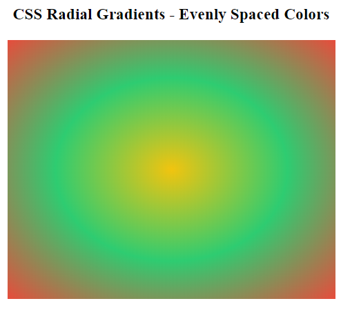
By default, the shape is set to ellipse, position is at center, and size set to farthest corner. When stop % is not mentioned, by default all 3 colors are evenly spread.
<style>
      #radial-grad {
           height: 300px;
           width: 25%;
           background-image: radial-gradient(#f1c40f, #2ecc71, #e74c3c);
       }
</style>
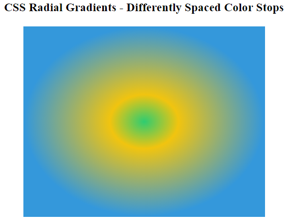
Radial CSS Gradients With Differently Spaced Color Stops
The three colors can be specified with stop values in %. Now, if we wish to set the color green to 0%, color yellow at 20% and color Red at 70%.
<style>
       #radial-grad {
           height: 300px;
           width: 25%;
           background-image: radial-gradient(#2ecc71 0%, #f1c40f 20%, #3498db 70%);
       }
   </style>
Radial CSS Gradients With Circle Shape:
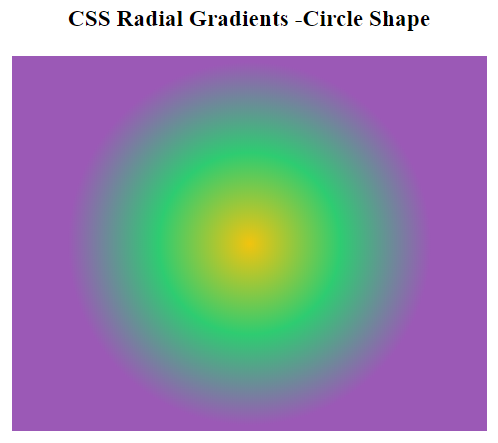
By default, the gradient shape is set to elliptical. Set the value to circle if you want a circle shaped radial CSS gradients.
<style>
          #radial-grad {
           height: 300px;
           width: 25%;
           background-image: radial-gradient(circle, #f1c40f 0%, #2ecc71 30%, #9b59b6 60%);
       }
      </style>
Radial CSS Gradients With Different Size Values
Size value of Radial CSS Gradients specifies the size of the ending shape. It can be one of the following 4 values –
Farthest-corner : Gradient is sized in such a manner that it meets the farthest corner from the gradient center.
Closest-corner : Gradient is sized in such a manner that it meets the closest corner from the gradient center.
Farthest-side : Default value. The gradient ends at the side which is farthest from the point of origin or center of the gradient.
Closest-side : Exact opposite of farthest-side. The gradient ends at the side which is closest from the point of origin or center of the gradient.
<style>
       #radial-grad1 {
           background-image: radial-gradient(circle farthest-side at 70% 40%, green, yellow , orangered );
       }
       #radial-grad2 {
           background-image: radial-gradient(circle closest-side at 70% 40%, green, yellow , orangered );
       }
       #radial-grad3 {
           background-image: radial-gradient(circle farthest-corner at 70% 40%, green, yellow , orangered );
       }
       #radial-grad4 {
           background-image: radial-gradient(circle closest-corner at 70% 40%, green, yellow , orangered );
       }
   </style>

An ideal online user journey includes a website (or app) that inculcates the essentials of responsive web design, thereby providing an exceptional experience with css device width.
Radial CSS Gradients With Different Position Values
The position value for radial CSS gradients could be specified either by using top, right, bottom, center(or combinations of these) or in %. By default the position is set to “at center center” or “at 50% 50%”. First value represents x-axis position while second value represents y-axis position.
<style>
       #radial-grad1 {
           background-image: radial-gradient(circle farthest-side at 50% 50%, #f1c40f 0%, #2ecc71 70%, #9b59b6 100%);
       }

       #radial-grad2 {
           background-image: radial-gradient(circle farthest-side at 0% 50%, #f1c40f 0%, #2ecc71 70%, #9b59b6 100%);
       }

       #radial-grad3 {
           background-image: radial-gradient(circle farthest-side at center right, #f1c40f 0%, #2ecc71 70%, #9b59b6 100%);
       }

       #radial-grad4 {
           background-image: radial-gradient(circle farthest-side at bottom right, #f1c40f 0%, #2ecc71 70%, #9b59b6 100%);
       }

   </style>

Radial CSS Gradients With Sharp Color Stops
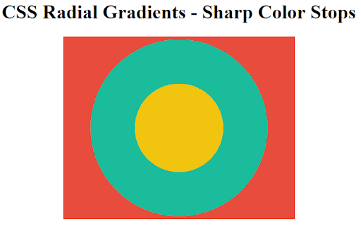
Instead of gradual progressive blending of 2 colors, you can alter color stop values in such a way that you can obtain sharp direct transition between 2 colors to obtain sharp color bands.
#radial-grad {
           height: 300px;
           width: 25%;
           background-image: radial-gradient(circle, #f1c40f 0%, #f1c40f 30%, #1abc9c 30%, #1abc9c 60%, #e74c3c 60%, #e74c3c 100%);
       }
Cross Browser Compatibility Solution For Radial CSS Gradients
Radial CSS Gradients enjoy the same browser support as CSS Linear Gradients that we discussed above, offering great cross browser compatibility. All modern browsers like Google Chrome, Mozilla Firefox, Opera, Safari and Edge support radial CSS gradients. The only exception is in Internet explorer IE 6–9. Just like in the case of CSS linear gradients, we can use vendor prefixes and fallbacks to provide support for older browser versions, and then perform manual/ automated cross browser testing to see if our fixes are actually working or not.
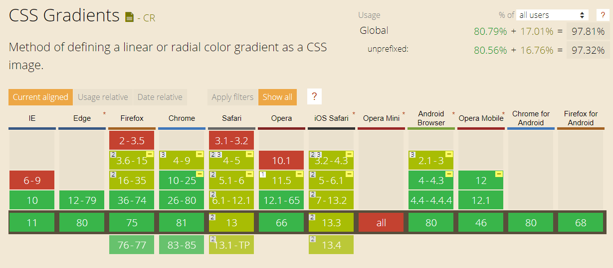
CanIUse Cross browser compatibility tabe for Radial CSS Gradient
Cross Browser Compatible Syntax For Radial CSS Gradients
Modern versions of all major browsers support the W3C standards for Radial CSS Gradient.
- For Chrome 25+, Firefox 16+, Opera 15+, Safari 6.1+, IE 10+, iOS 7+, Android 4.4+
background-image: radial-gradient(circle at center, #f1c40f 0%, #1abc9c 100%);
NOTE: modern new unprefixed syntax requires you to use “at” when specifying the position. It is not required in older prefixed syntax shown below.
In order to add support for older versions of chrome, firefox, safari and opera we will use specific vendor prefixes mentioned below and create a cross browser compatible solution. Use JPG fallback or a polyfill to make radial CSS gradients work in IE 6–9.
- For Google Chrome(v 4–9) and Safari (v 4–5)
background-image: -webkit-gradient(radial, center center, 0px, center center, 100%, color-stop(0%, #f1c40f), color-stop(100%,#1abc9c));
- For Google Chrome (v 10–25) and Safari(v 5.1–6)
background-image: -webkit-radial-gradient(center, circle, #f1c40f 0%, #1abc9c 100%);
- For Mozilla Firefox (v 3.6–15)
background-image: -moz-radial-gradient(center, circle cover, #f1c40f 0%, #1abc9c 100%);
- For Opera(v 11.5)
background-image: -o-radial-gradient(center, circle, #f1c40f 0%, #1abc9c 100%);
- Solid color or JPG/SVG fallback
background-color: red; or background-image: url(fallback.jpg)
IE filter property can only be used to create 2 color linear gradients and not radial CSS gradients. hence it is difficult to replicate radial CSS gradients for IE6–9. Either use a linear gradient or JPG/SVG fallback
Learn the different methods to inspect web elements on the chrome inspect devices.
3. CSS Conical Gradients
CSS conical gradient function can be used to create a circular gradient pattern similar to radial CSS gradients. However, while radial CSS gradients creates a pattern in which color stops radiates outwards from the center but in the case of conical CSS gradients, color stops are placed around the center point of origin. It is dubbed as “conic” because of its cone like appearance if viewed from above.
The positions of different color-stops in a conical CSS gradients are defined either in terms of deg or percentages. 0% corresponds with 0deg while 100% corresponds to 360deg. The degree or % position value increases as you converse in clockwise direction. Although a value greater than 360deg or 100% is permitted, it will not be clearly visible on the conical CSS gradients canvas but might still alter the color stop distribution.
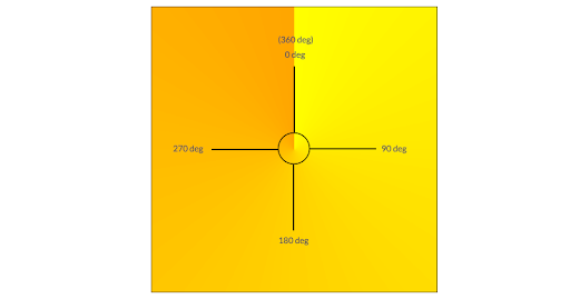
Syntax For Conical CSS Gradients
background-image: conic-gradient( , colorStop1 angle, colorStop2 angle, …);
Starting Angle : From angle can be specified in terms of either deg or %> By default set to 0deg or 0%
Position : position can be specified in terms of center, top, left, right, bottom or in terms of %. By default conical CSS gradients position is set to center or 50%.
color-stop : Each color stop can be specified with starting and ending anle.By default angle of first color stop and last color stop is set to 0deg and 360deg.
Now, we look at some examples of conical CSS gradients.
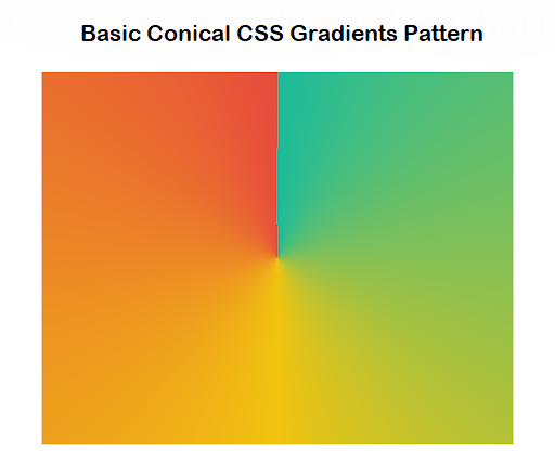
Basic Conical CSS Gradients Pattern
A conical CSS gradient with starting angle of 0deg, at center position and three color stops
<style>
       #conic-grad {
           width: 25%;
           height: 300px;
          background: conic-gradient(#1abc9c 0deg, #f1c40f, #e74c3c 360deg);
       }
   </style>
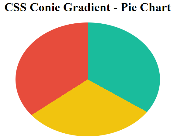
2. Creating A Pie Chart With CSS Conical Gradients
You can use CSS Conical gradient to create a Pie chart by defining color stops with sharp transitions. As i stated before, each color stop specified in the conical gradient function can be complemented with a starting and ending angle. To obtain a sharp or instantaneous instead of gradual progressive transition value of starting angle of a color stop is less than or equal to ending angle of the previous color stop. So either set starting angle of each color stop to 0% or set ending angle of 1st color stop equal to starting angle of 2nd color stop and so on. Finally, set the border radius of the element to 50% to obtain a circular div.
<style>
       #conic-grad {
           width: 25%;
           height: 300px;
           background: conic-gradient(#1abc9c 0% 33%, #f1c40f 0% 66%, #e74c3c 0% 100%);
           /*background: conic-gradient(#1abc9c 0% 33%, #f1c40f 33% 66%, #e74c3c 66% 100%);*/
           border-radius: 50%;
       }
   </style>
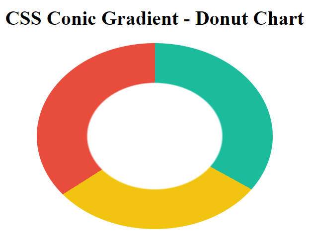
Creating A Donut Chart With CSS Conical Gradients
In order to create a donut chart using conical CSS Gradients, you can make use of both radial and conical gradient. Use sharp solid transition between 2 color stops — white and transparent in the radial gradient. Transparent color stop will coincide with the visible conical CSS gradient, giving the appearance of a donut chart. You can also create a pseudo element using :after or :before to create the white circular element at the center of conical CSS gradient.
<style>
       #conic-grad {
           width: 25%;
           height: 300px;
           background: radial-gradient(white 40%, transparent 41%), conic-gradient(#1abc9c 0% 33%, #f1c40f 0% 66%, #e74c3c 0% 100%);
           border-radius: 50%;
       }
   </style>
Cross Browser Compatibility Solution For CSS Conical Gradients
CSS conical gradient is still in experimental stage and hasn’t been adopted yet by the majority of modern browsers. Only Google Chrome 69+ and Safari 12.1+ in desktop browsers and iOS safari 12.2, Android 12.2+ and Chrome Android 67 among mobile browsers provide browser support for this feature. Other popular browsers like Mozilla Firefox, Opera and Edge still haven’t rolled out support for conical CSS gradient.
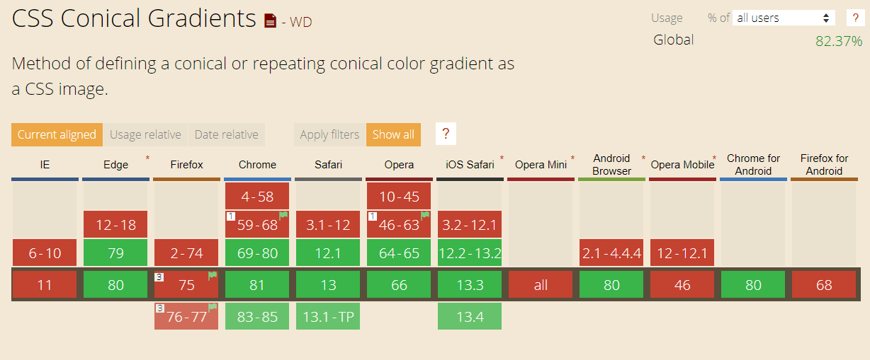
CanIUse Cross browser compatibility table for CSS Conical Gradient
In order to provide CSS conical gradient functionality for unsupported browsers, you can make use of an ingenious polyfill by Lea Verou.
4. CSS Repeating Gradients
CSS Repeating gradient function helps to generate a repeating linear, radial, or conical gradient image. Color stops are repeated either along a line or around a point of origin indefinitely until it encompasses the entire element canvas. CSS repeating gradient function is of three types : repeating-linear-gradient(), repeating-radial-gradient(), and repeating-conic-gradient().
repeating-linear-gradient() :
CSS repeating-linear-gradient function is used with the exact same syntax as CSS linear-gradient function, also, it accepts the same arguments. The difference between the two lies in the fact that in case of linear-gradient, color stops are spread across the gradient axis gradually, and occupy the entire element without repetition. On the other hand, in the case of repeating-linear-gradient, colors stops are repeated in a linear manner along the specified direction. Each color stop is separated from each other by a distance equal to the difference between last color stop and the first color stop.
Syntax For Repeating Linear Gradient :
background-image: repeating-linear-gradient(45deg, red 10px, blue 60px);
The two colors are shifted by the difference between the last color-stop and the first one which is 60–10px = 50px. This is equivalent to linear-gradient(45deg , ..., red -40px, blue 10px, red 10px, blue 60px, red 60px, blue 110px, ...);
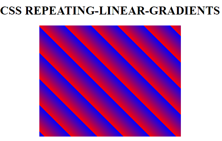
In order to create color stripes with sharp transition, ending color stop of first color should be equal to starting color stop of next color. Consider this example –
<style>
    #repeating-linear-grad1 {
           width: 25%;
           height: 300px;
           background-image:
           repeating-linear-gradient(45deg, yellow 10px, yellow 20px, #009966 20px, #009966 30px, purple 30px, purple 40px);
    }
   </style>
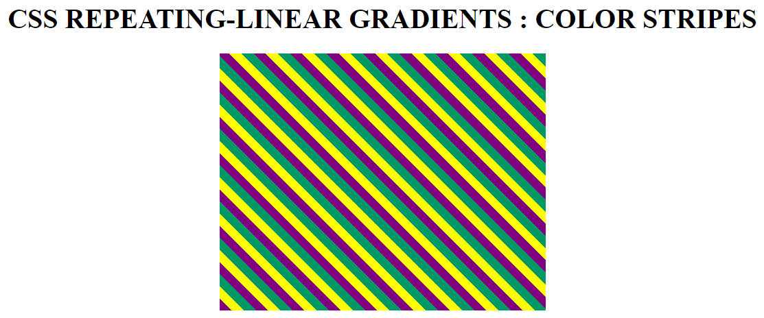
repeating-radial-gradient() :
CSS repeating-radial-gradient function has the exact same syntax as CSS radial-gradient function and accepts the same arguments. The difference between the two lies in the fact that in case of radial-gradient, color stops are spread across the gradient virtual ray gradually in an elliptical or circular manner occupying the entire element without repetition. On the other hand, in the case of repeating-linear-gradient, color stops are spread in a circular manner to form repeating bands that cover the entire element. Each color stop is separated by a distance which is equal to the difference between last color stop and the first color stop. End of each color stop coincides with starting of next color stop.
Syntax :
background-image : repeating-radial-gradient(circle at center, red 10px, blue 60px);
The two colors red and blue are shifted by the difference between the last color-stop and the first one which is 60–10px = 50px. This is equivalent to - radial-gradient ( circle at center , ..., red -40px, blue 10px, red 10px, blue 60px, red 60px, blue 110px, ...);
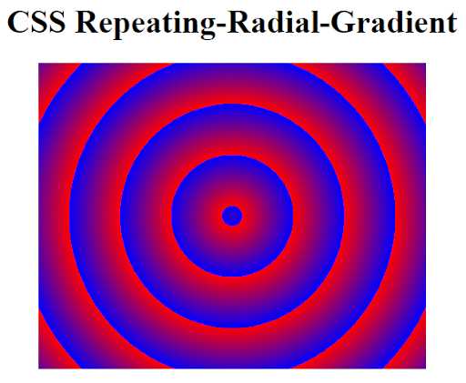
In order to create color stripes with sharp transition, ending color stop of first color should be equal to starting color stop of next color. Consider this example –
<style>
   #repeating-radial-grad {
           width: 25%;
           height: 300px;
           background-image:
           repeating-radial-gradient(circle at center center, yellow 10px, yellow 20px, #009966 20px, #009966 30px, purple 30px, purple 40px);
       }
   </style>
repeating-conic-gradient() :
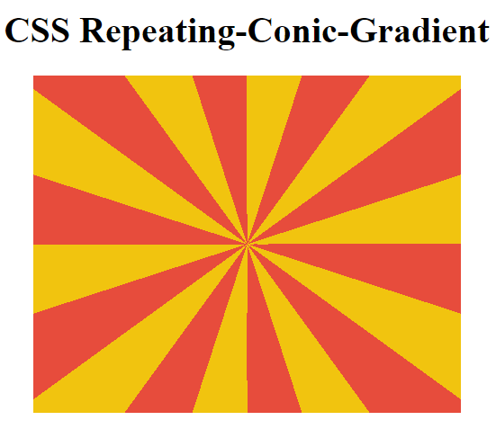
CSS repeating-conic-gradient works in a similar fashion to conic-gradient in terms of syntax and arguments but keeps repeating the color stops indefinitely until entire 360% or 100% of the element canvas is covered.
Syntax:background: repeating-conic-gradient(#f1c40f 0% 5%, #e74c3c 5% 10%);
Set the starting angle in % or deg of color stop equal to ending angle of previous color stop. in our example, the ending angle of #f1c40f color stop is set to 5% which is equal to the starting angle of #e74c3c color stop.
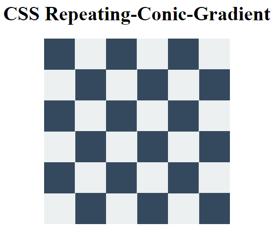
You can also create a checkerboard pattern easily by adding a single line of CSS code. Set the “background-size” to “100% 100%”. Also alter the color stops by changing the angle of first color stop to 0% 25% and angles of second ccolor stop to 25% and 50%.
<style>
       #repeating-conic-grad {
           width: 300px;
           height: 300px;
           background: repeating-conic-gradient(#ecf0f1 0% 25%, #34495e 25% 50%);
           background-size: 100px 100px;
       }
   </style>
Test your native app and website on Mobile Testing Device Labs on the cloud with real iOS and Android devices. LambdaTest is a convenient, cost-effective and centralized solution for running real-time and Automated tests on real devices cloud.
What You Learnt!
Now, you are capable of creating any kind of gradients patterns by simply utilizing Native CSS gradients and cross browser compatibility tricks without relying on images and SVGs. Go ahead and try to apply CSS gradients to create a wide array of different UI elements like images with gradient overlays, gradient buttons, border outlines, shadows, skewed gradient masks etc. Keep in mind the importance of browser compatibility and devise a sound cross browser testing strategy. There is no point in presenting an outstanding web-page with CSS gradients which renders horribly on different browsers. Cheers!
